Posters and Flyers: Show Them What They’ll Hear
One strong image, a clear title, and room for dates you don’t know yet
A play for voices gets five minutes to win a listener’s ear. A poster gets three seconds while someone walks past a lobby. If it looks like a cluttered homework assignment, people keep walking.
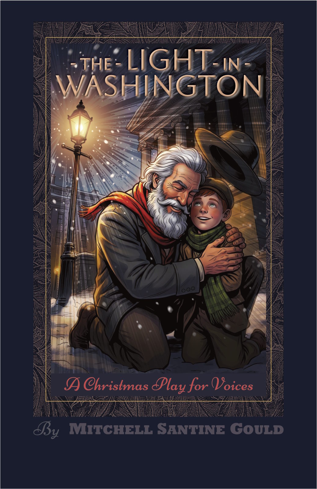
You aren’t designing a soap ad or a historical marker. You’re setting a mood, a period, and the emotional stakes in a single glance. Look at the 11-by-17-inch poster for The Light in Washington: you don’t need a plot summary to feel the warmth of the gaslight against the cold of a winter night in 1868.
Keep the layout bold, give the eye one clear place to land, and treat your words like dialog — every one has to earn its place.
Three Distances: How People Read a Poster
A good poster does three different jobs as someone walks toward it:
-
From across the room (10 feet): one picture.
Give the eye a single, striking image. On our poster, it’s Walt and little Freddie kneeling in the snow, hugging each other beneath a glowing streetlamp. In half a second, the eye picks up the golden light, Walt’s red scarf, and the tall columns behind them. Don’t scatter five floating heads across the page; pick one emotional center and commit to it.
-
Halfway there (5 feet): the title and the kind of show.
The title and subtitle tell people what they’re looking at. The glowing capital letters of the title name the play; the red script beneath it — A Christmas Play for Voices — tells readers exactly what kind of evening it is. Keep it to ten words or fewer. Never make a passerby guess whether you’re offering a political thriller or a gentle holiday story.
-
Up close (arm’s length): the details.
The author’s name and, later, the practical information. On our poster, the author’s name sits on the dark navy band at the bottom, quietly, so it doesn’t compete with the picture. When the poster is used for an actual performance, that bottom band is where the dates, the address, and a QR code for tickets will go, kept separate from the artwork.
Frame, Contrast, and Space: Period Flavor Without the Clutter
Posters for historical plays often drown in fake-parchment textures and fancy script you can’t read. Be disciplined:
File Specifications: Print and Online
Build your master files to standard printing specs from the very start. (A few terms: CMYK is the color mode printers use; RGB is the color mode screens use; DPI means dots per inch, a measure of sharpness; and bleed is a thin extra margin of artwork that gets trimmed off, so the color runs all the way to the edge.)
| Item | Specifications | What Matters Most |
|---|---|---|
| Lobby poster | 11 × 17 inches, CMYK, 300 DPI, ⅛-inch bleed | Deep blacks and bright gold. It has to stand out behind glass in a dim lobby. |
| Program cover | 5½ × 8½-inch booklet, 300 DPI, heavy uncoated paper | A warm feel. Matte paper looks and feels right for a period piece. |
| One-page pitch | Letter-size PDF, RGB, under 5 MB | Easy to read in an inbox. Picture at the top; a one-sentence summary, cast needs, and your contact information at the bottom. |
| Social media and web | 1200 × 630 pixels and 1080 × 1350 pixels, RGB | Crops cleanly. The main image should still work when cropped to a square thumbnail. |